Pixelization, ASCII, and computer vision inspired us. So I built a web tool that transforms images and video with these algorithms. That tool became the visual identity.
Team
This took a team of five. I was lead designer. Pedro Anjinho, Leonor Brandão, and Nuno Pinto helped me define the visual identity. Ana Feu joined later to apply it across digital and physical surfaces. I built the web tool. Nuno and Anjinho designed the website (not shown here since I wasn't involved, but it was an enormous endeavor on its own). The rest was split across the team.
The Shift APPens team (a joint effort between members of NEI/AAC and jeKnowledge) judged our output, plus the directive boards of both.
Inspiration
While defining the visual identity, we looked at programming-adjacent graphics. Computer vision, dithering, terminal UIs, ASCII art, early gaming visuals, pixelization, vaporwave, digital collage.
We gravitated to Enigmatriz's ASCII explorations. Specifically artwork that used pixelization and ASCII characters superimposed to build shading, displaying more definition than either technique alone.
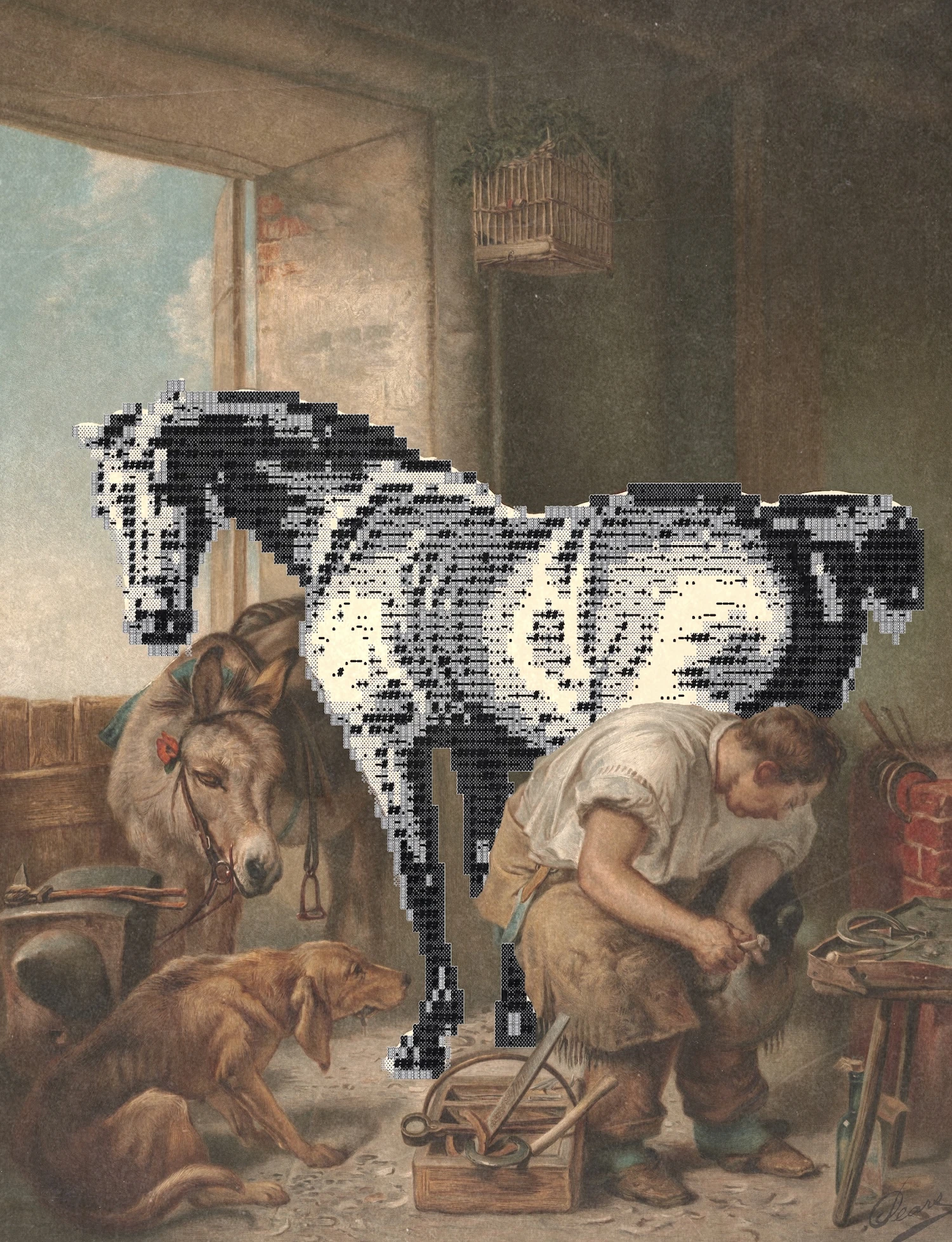
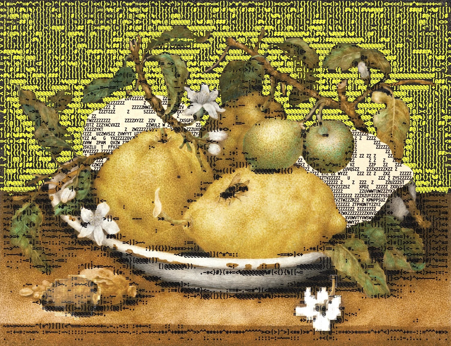
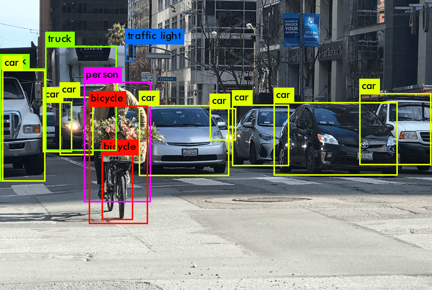
Computer vision object detection was another big influence. Its boxy, rectangular overlays on organic images make a similar juxtaposition to the work shown above. Intellectually, it is just as interesting. Its procedural nature creates graphical compositions from surveillance. The visual product is a secondary effect, an emergent behavior.
Tool development
I built a tool that combines pixelization and ASCII to abstract an image. Adding a flood-fill algorithm to outline groups of same-colored pixels, creating forms within forms.
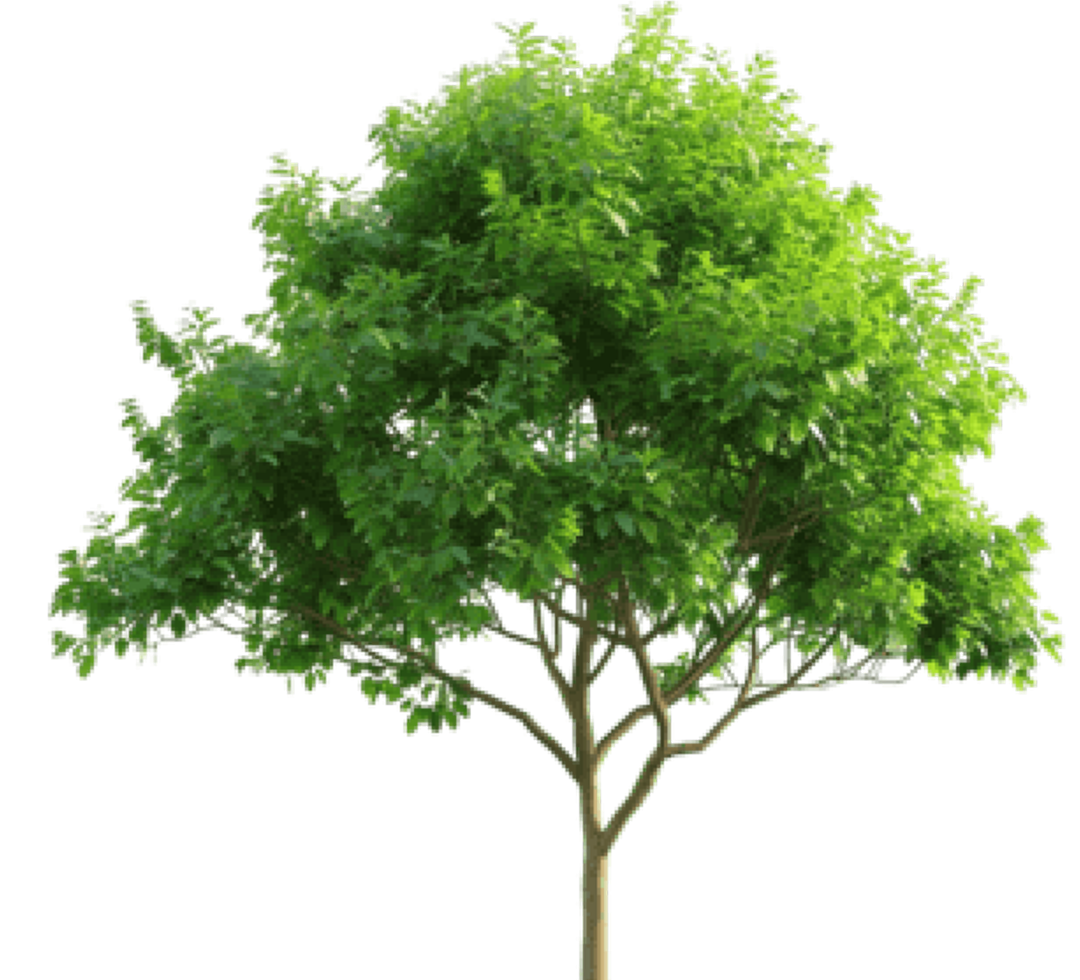
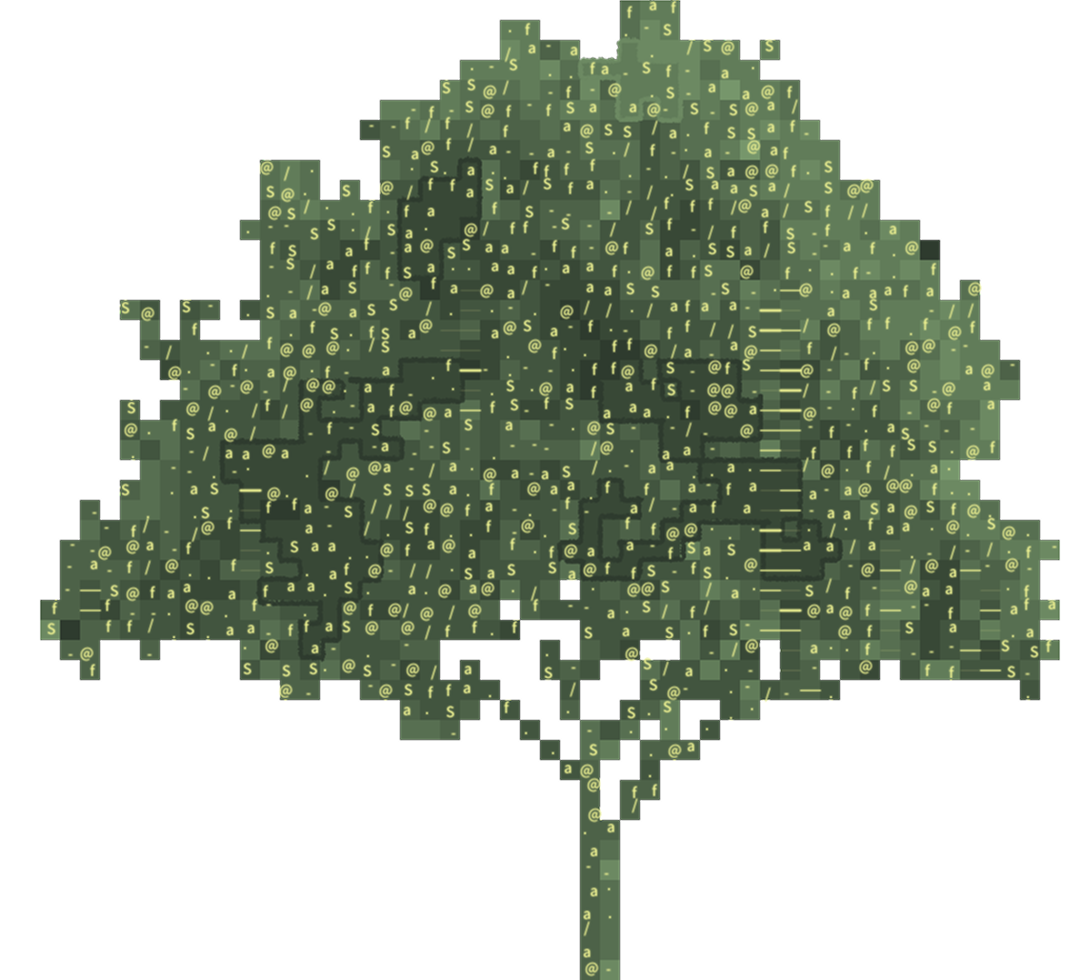
The results were good enough to chase further. I ported the code from Processing to P5.js, then built an interface in SvelteKit to tweak the parameters live. I added video support too, processing a video as images in bulk. The result led to a new idea of working the output: layering the generated image as a transparency layer over the original photo. This transformation is the closest to the rigid-organic contrast that drew us to our inspirations in the first place, rendering four different layers:
ASCII
->
Group Pixel Outlines
->
Pixelization
->
Original Image
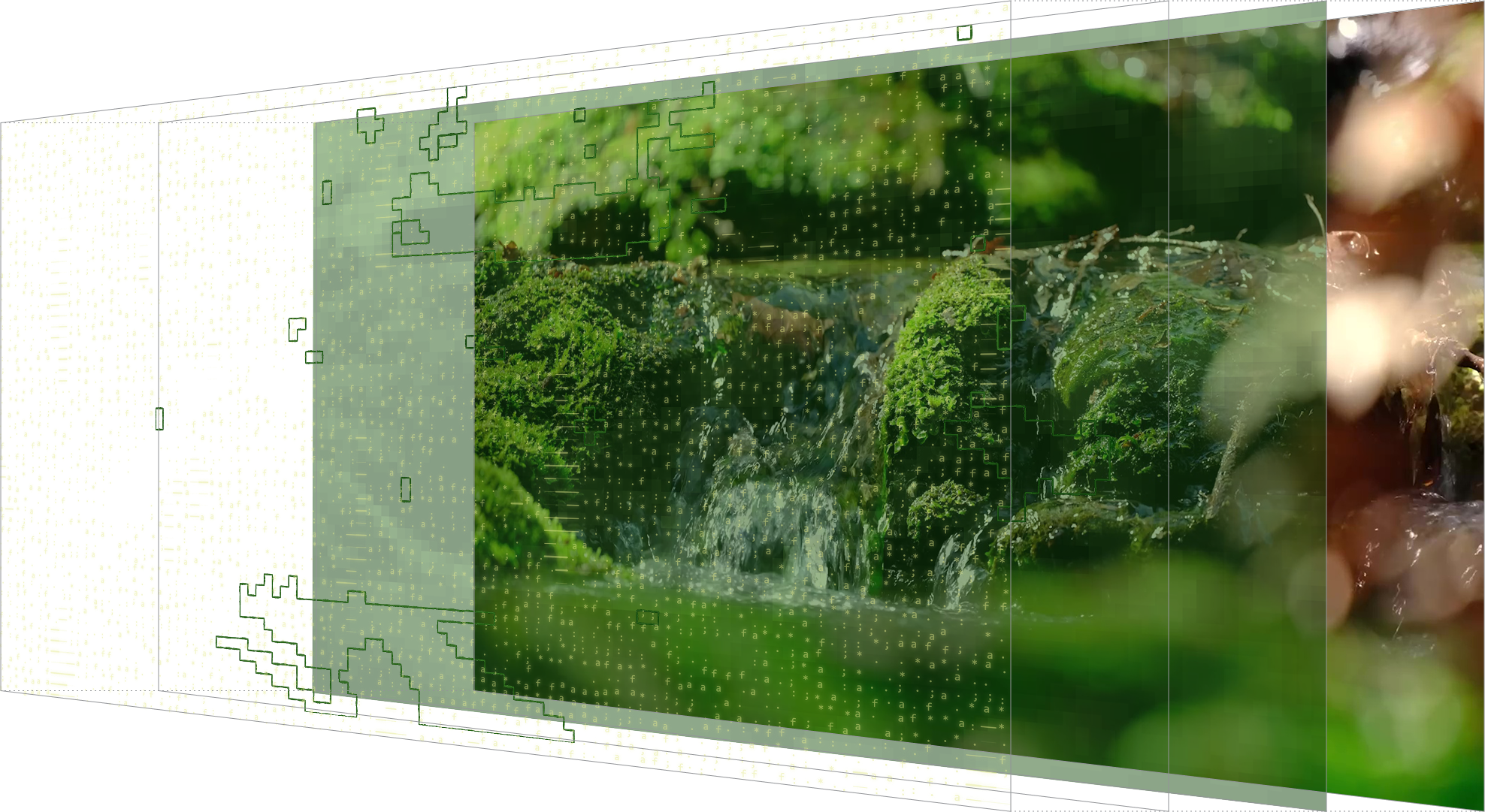
The program we ended up using featured a grand collection of parameters that changed the result considerably. The UI made it easy for exploration. Some micro-decisions were offset to the algorithm, making the visual product of human-computer collaboration. A "Redraw" button gave control over the computer. It re-rolled algorithm "choices", giving quick, different iterations. (See them animated in the second post under Social Media.)
Visual Identity
Everything else, typography, colors, grid, came from the images the tool produced. We picked a bold, big sans-serif for legibility (Inter), since our generated images were often noisy. We defined four color sets, intended to be mixed between ASCII and pixelization for variety. The image output was striking enough that we could stay looser with other aspects. The logotype was something we could not remake as it is something that is carried on through editions.
Social Media
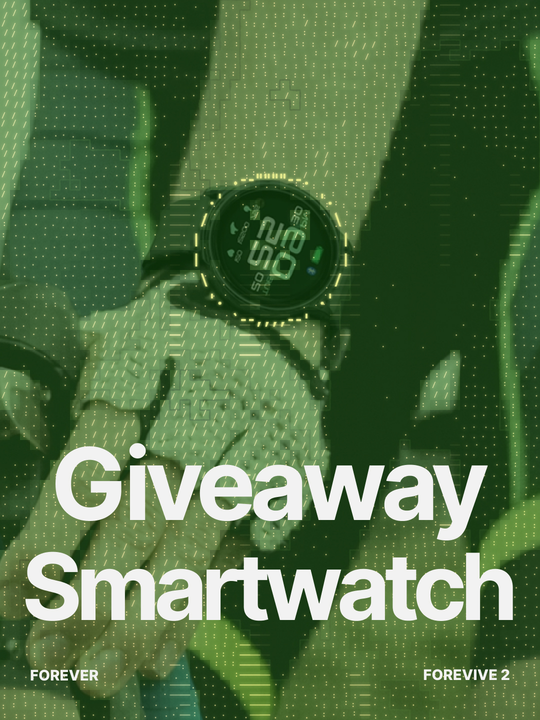
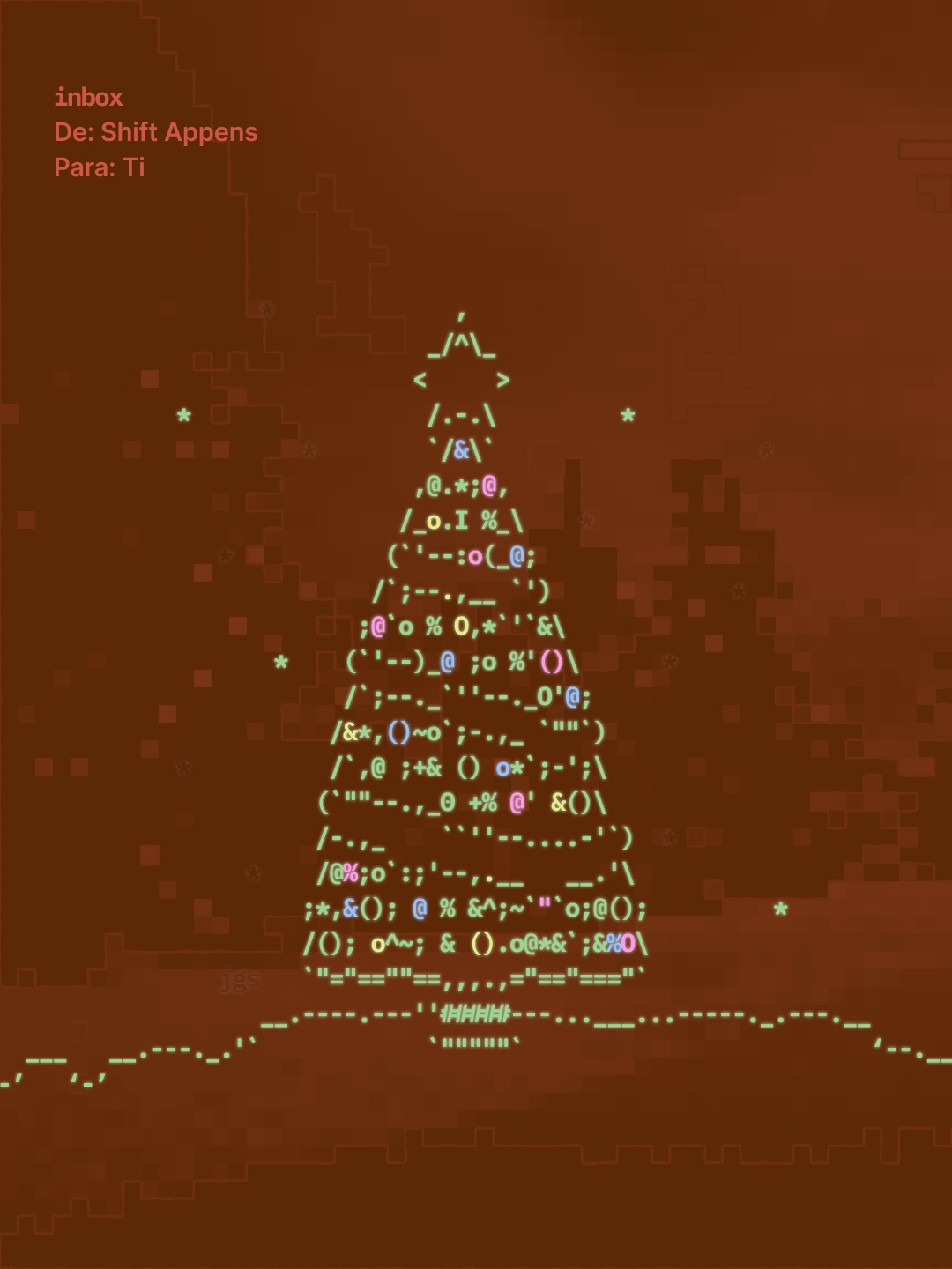
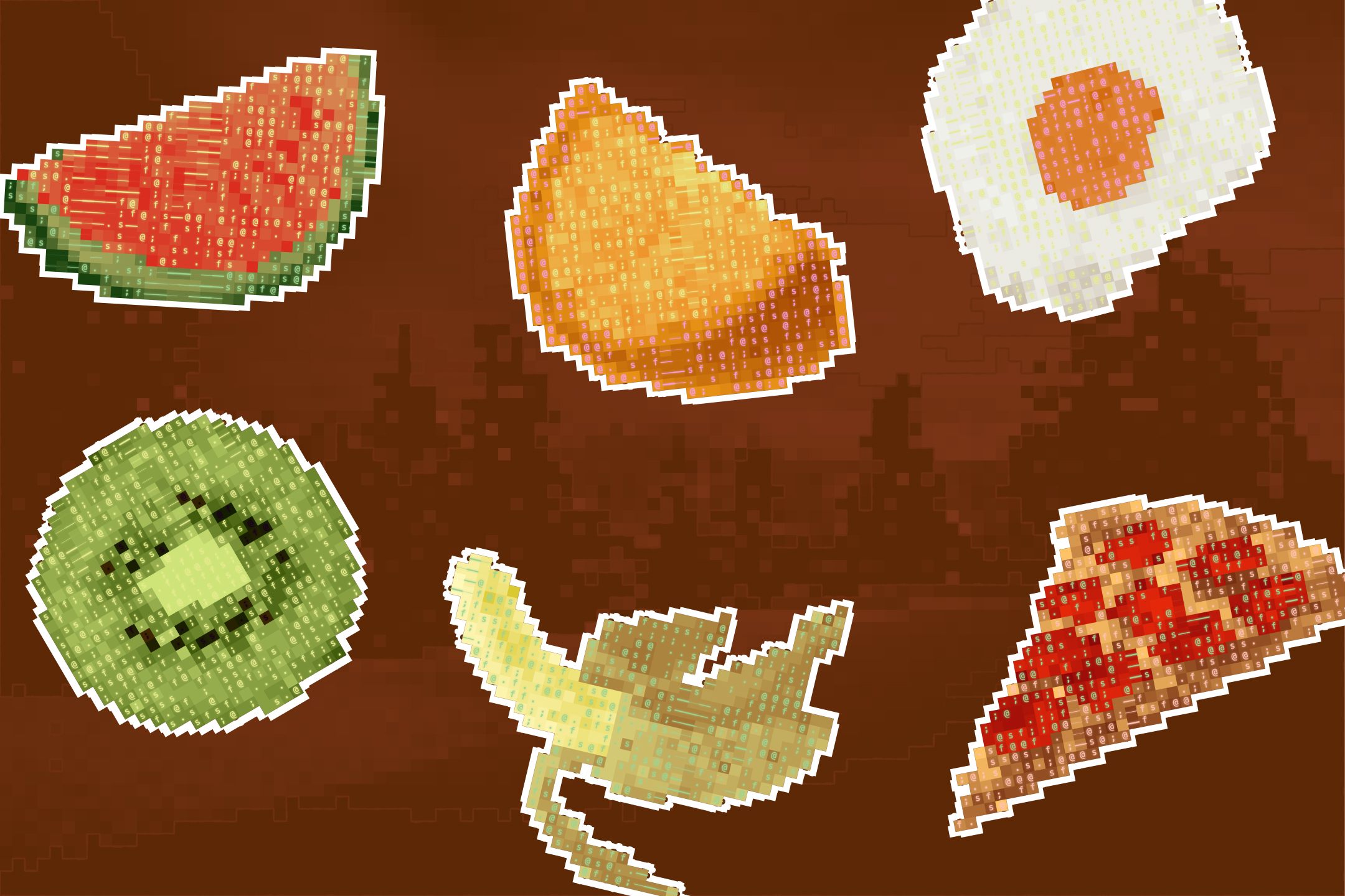
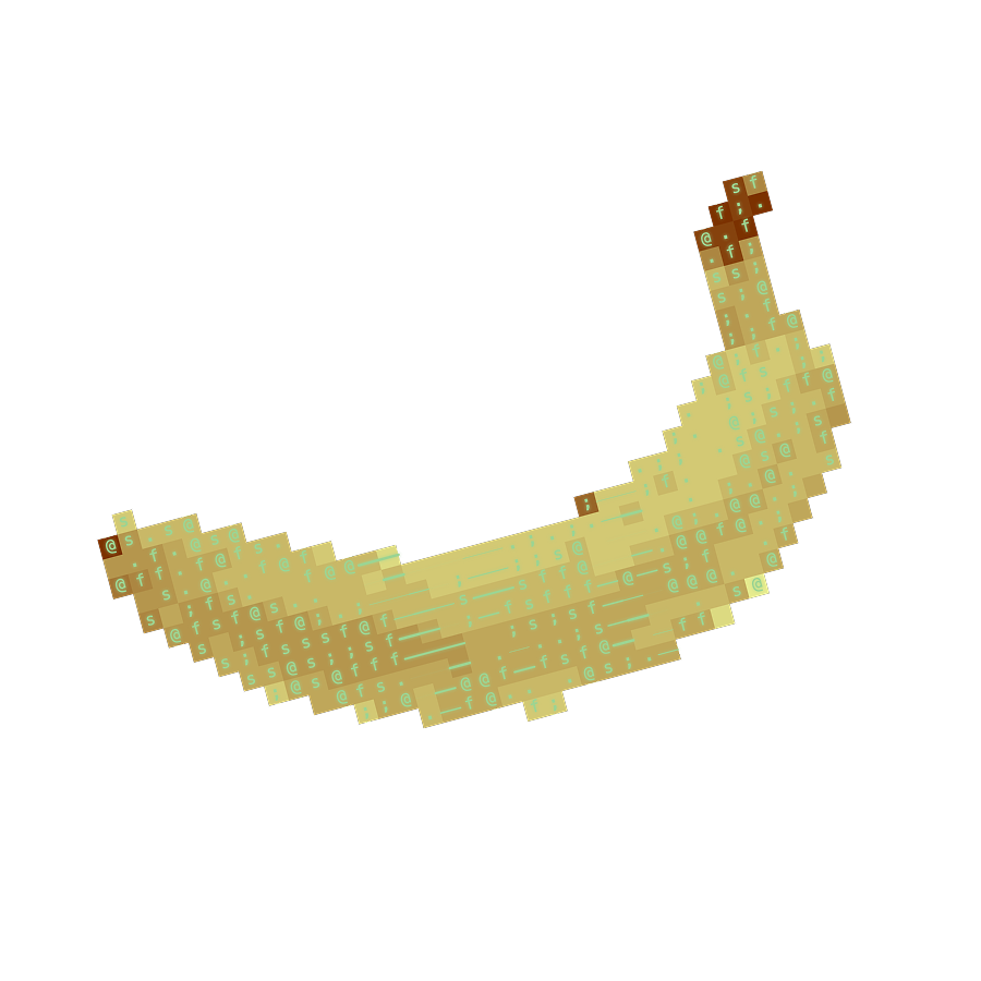
As we made more Instagram posts, we found new ways to use the processor. Four styles stuck, shown below in order: as an object on a flat background, an abstract formless image, a transparent layer over a photo, and a background for ASCII art on top.
Other Surfaces
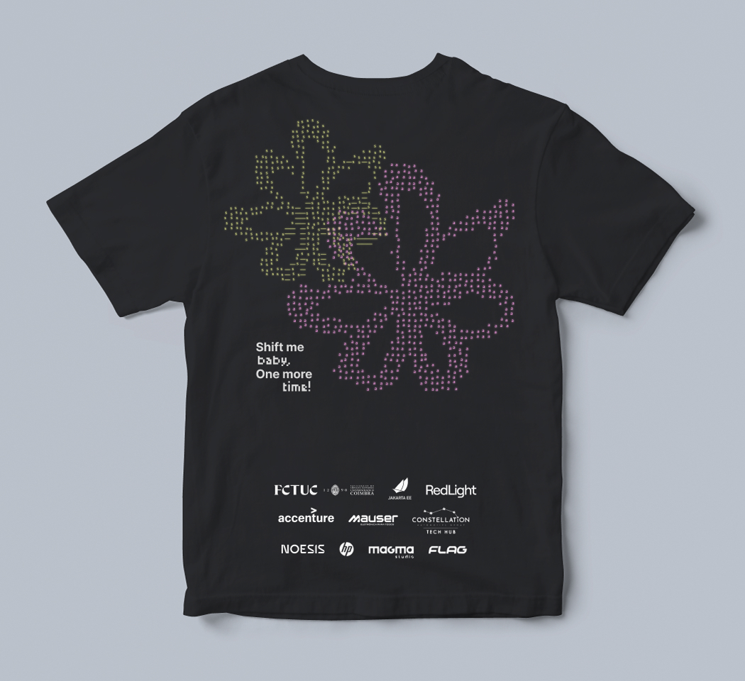
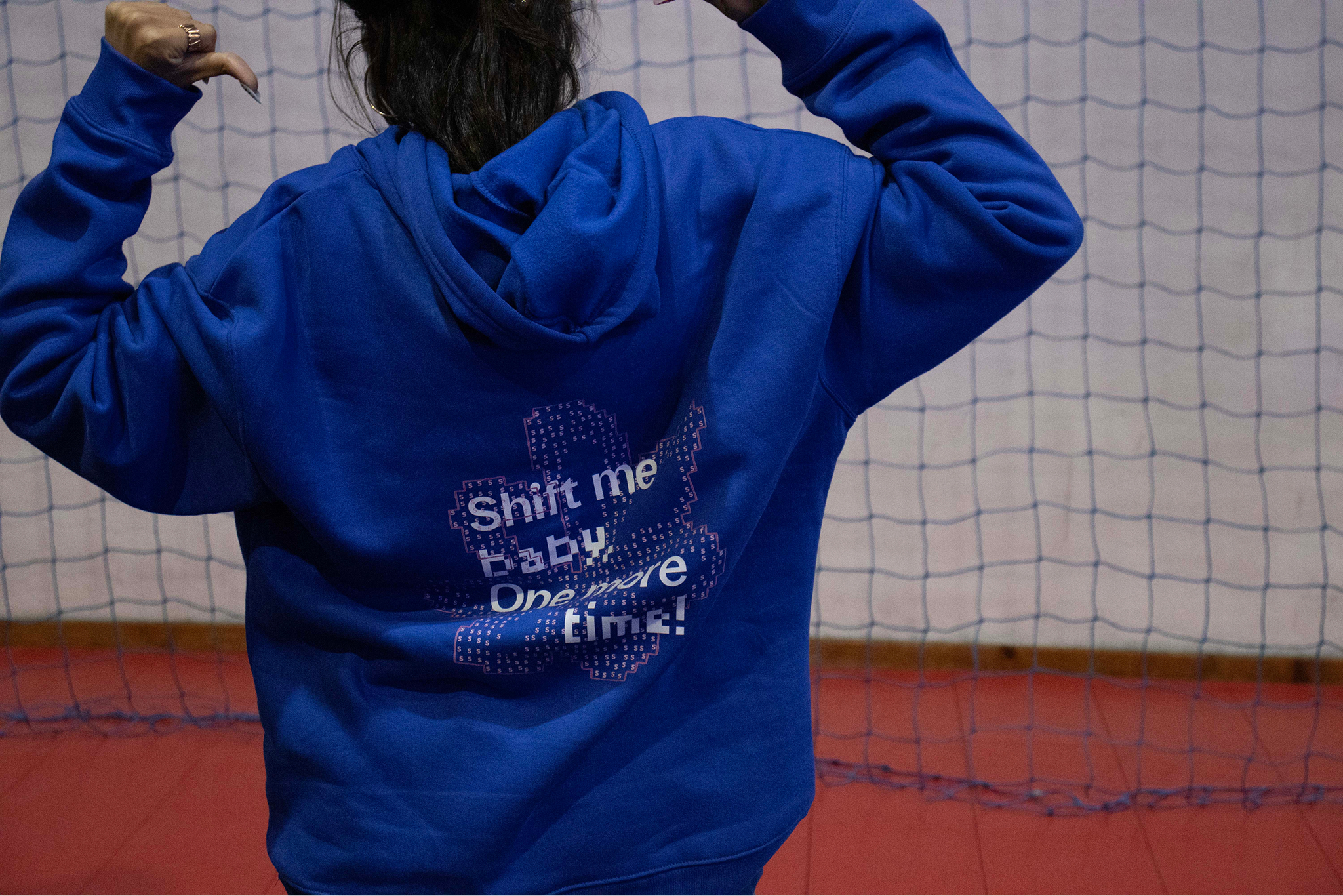
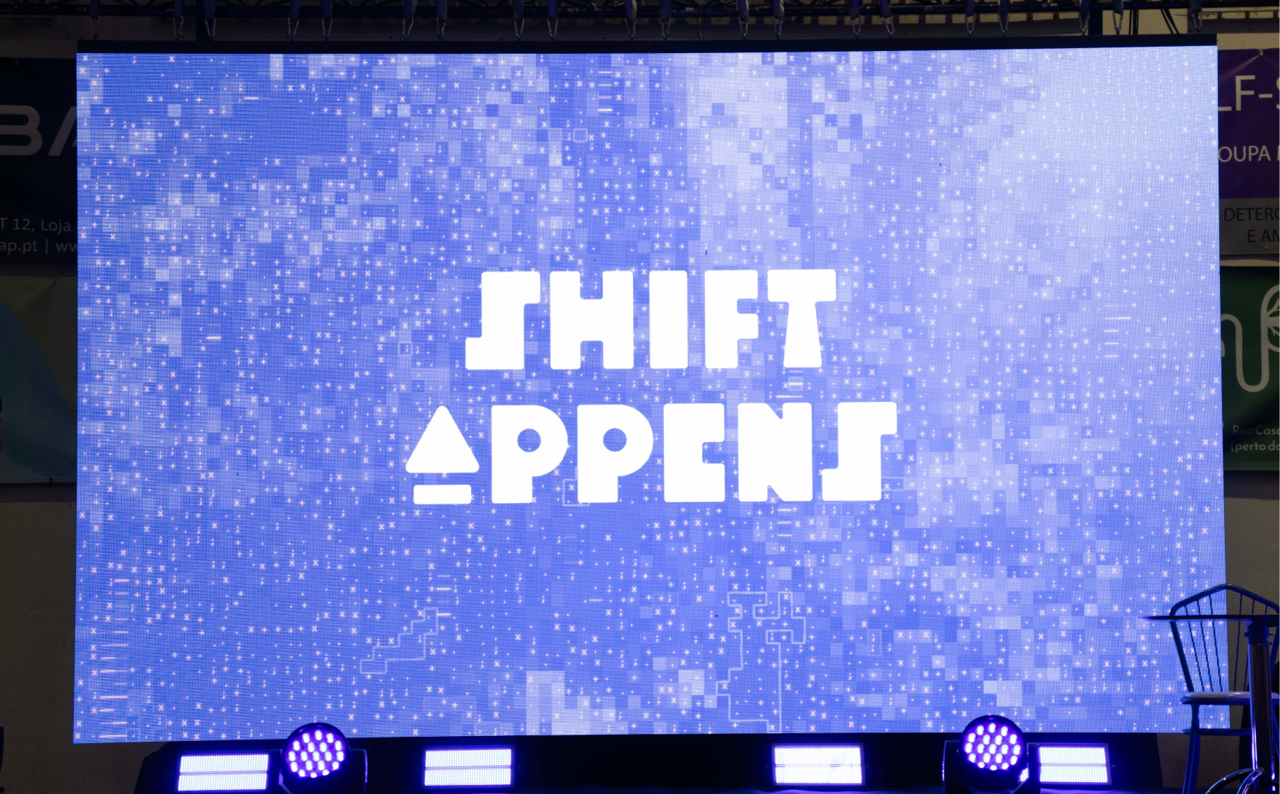
Beyond Instagram, the aforementioned website, and boring stuff like documents, we made merch, stickers, and slides for the big screen at the hackathon.
Project in Review
Leaning so hard on the image processor sometimes meant less polish elsewhere. This shows up in some cases. When the generated image wasn't particularly interesting, the whole object fell apart.
Still, this project is more interesting for its process than its output. For me, it meant a new way of working.
Conceptualize the identity
->
Make a tool
->
Realize the identity
Beyond the wow factor, building a tool for one specific job speeds things up (I can't imagine how long one of these posts would take to do manually). It also invites exploration within its own limits, and throws up unexpected results when going past them.
Try the tool
I originally intended the web tool to be used in a small competition inside the hackathon. That never happened, so the UI is rough and clunky because it was made for the design team only. You'll figure it out. Try it here.
░░░